NOTE 008 - In Depth Watercolor Tutorial "Vines" DIY

In-Depth Watercolor Tutorial
Today's post will be a long one because it is special.
I hope you will give it a try. I will try to be as detailed as possible
& give some tips as well. I want it to be more of an art lesson that
you can apply to the future, rather than a one time deal.
Let's start!

TIP: Read through the whole tutorial or any tutorial for that matter,
so then you can get a good idea of what you are doing & you will be
less likely to forget something when you actually do it.
DIFFICULTY: Beginner - Intermediate
This tutorial is leaning more to intermediate, but it is good practice for a
beginner. The hardest part will be the shading and water control which
are important aspects of watercolor painting. If you are a beginner, you
don't have to do the shading if you don't want to. It will still look nice without
it. Practice makes perfect! I mean it, it really does.
MATERIALS:
Watercolor Paper - I am using Arches Cold Pressed
Watercolor Paint - Mijello Mission Gold
Masking Tape - Scotch Painter's Tape
Paintbrush - I am using a size 10 Round
Paper Towel or Cloth
A stiff board or surface to tape the paper to.
Water
Pencil
Tips regarding materials:
Paper - The paper you use can contribute to how it will look in the end.
In fact, I used the same colors on this paper & on Canson L'Aquarelle Heritage
& there was a difference in the colors. Arches is my favorite paper yet because
of vibrancy. Different papers have different properties. As a cheaper option,
I like Canson XL paper, although I haven't tried this painting on this paper.
Paint - The quality of your paint is important as well. There are student
quality paints & artist quality paints. Student paints are usually less
pigmented in comparison to artist quality paints. There is usually a
huge price difference as well. If you want intense color then you will
need artist quality paints. Other factors come into play as well, like lifting
& how well it blends. If you want artist quality for a reasonable price,
I started with the Kuretake Gansai Tambi set.
Masking Tape - I have used different types of washi tape before, but it didn't take
the water well. It ended up peeling off. I use painter's tape because
it holds up well. I recommend using a tape to keep your paper
from warping. I have done stretching to my paper before, but it made it worse
and it wouldn't hold the paint the same. If you want nice clean borders as
well, I recommend using tape. If your are doing this in a journal, of course it
is optional.
Paintbrush - Now your brush is up to you. It just needs to hold water & paint
well. I recommend having a nice tip that is a bit pointed so you can get in the tight spots.
You can use more than one brush if you would like, but I like to stick to one
brush. I am using a size 10 round, but feel free to go smaller if you are a beginner.
A stiff board or surface - This will depend on what you have
available. I am using a small plastic covered stiff cardboard piece. It came in
some packaging from a stationery set. You want a surface that is stiff, yet
water resistant. You can use a clipboard or a chopping board.
You need a paper towel or cloth to dry your brush on.
Water, because watercolors.
And it doesn't matter what pencil you use, I recommend having
an eraser though.
And skills...
Your ability & skills will vary. Your materials & skills will determine
the final outcome. You don't have to have a bunch of fancy stuff.
You don't have to be experienced. It's okay.
The important thing is to have fun and learn!

STEP 1: Determining the size
My paper measures 3 inches X about 4 inches. (7.7 x 10 cm)
I measured 0.5 cm around my paper for the border & taped it to my board.
I am using a small size because I plan to send it in some snail mail.
TIP: I recommend sticking small when doing watercolor. Although this
is very small. I have done this painting post card size as well & it turned
out great. I have done 9x12 paintings before and not like them because
you have more area to cover & it dries quickly. Any mistake shows more to
me. You don't have to stay small, but that is what I prefer. If you are
a beginner, I recommend keeping it small.

STEP 2: Drawing Your Vines
This is when we have to start making decisions.
Determine where you want your vines to be.
What direction and angle do you want them go in?
Which ones do you want to be in front or in the background?
I just drew a line to start with. Don't make it straight.
Give it shape. Then I drew a line on the other side. Draw the vines you want
in the background slightly smaller than the ones you want in the foreground.
As you can see from the photo above, some of them are thicker & some are
thinner. The thinner ones will be in the background.
You can also draw a few leaves if you would like to get a feel for what
you are doing. Sometimes I do that myself. Don't be afraid to
cross the vines over each other.
TIP: Having thinner & thicker lines in this painting helps us to bring
perspective into this painting. This adds more depth and makes it come to life.
You will be able to learn about the use of perspective throughout this tutorial.

STEP 3: Adding Leaves
I got the inspiration for these leaves from the vine of my sweet potato plants.
You can look up photos of them for reference if you would like.
The leaves are kinda shaped like a heart. I start with my vines that will
be in the foreground. Take angle into consideration. How do you want the
leaves to lay? I put them facing various directions, just as they would be on the
vine. We also have to remember that leaves are usually on the front, back, & sides of
the vine. I made the leaves on my front vines larger than my vines in the background.
I shaded in my background vines to show you guys. You can do this if you
would like, since it won't be noticeable later. I also erased any lines running
through the leaves and cleaned the sketch up a bit.
TIP: Don't worry if your sketch is messy. This is actually one of the neatest sketches
I have done with this painting. Also, don't be afraid of pencil lines. I used to be self-conscious about being able to see the pencil in my paintings. It helped me to
remember that the sketch is an important part of the painting process & if you can see your pencil markings, they belong there. They are an important part of the process.

STEP 4: Deciding on Colors & First Layer
You may have decided you color palette earlier & that is okay. I am using
You may have decided you color palette earlier & that is okay. I am using
- W537 Van Dyke Green
- W536 Viridian
- W502 Ivory Black
Notice, I am only using 3 colors. Sometimes
I only use 2 colors when doing this painting. My recommendation is to swatch
the colors you wish to use & make a color scale. You can see how light you can
use the color to how dark it can be. By doing this you get to know the color & the
paint better. My recommended colors for this painting are: blue, green, purple,
& pink. Just make sure the color you choose will do well with black. We
are using black in our darkest layer for the background.
For our first layer, we want it super light. We use a lot of water & very little paint.
I painted the whole canvas/paper.
NOTE: This is very IMPORTANT. Wait for every layer to dry completely before
moving on to the next step. This applies to any watercolor painting you are doing.
Unless you are going for a special effect, let it dry. For this painting, let the layers
dry. I know it is hard & you get excited, but it is very important. I know some have
used fans & blow dryers, but personally I have never done that. I usually do other
things while waiting.

STEP 5: Second Layer
For our second layer, we go slightly darker. I painted the whole
canvas/paper again. We are slowly going to use more paint with our water.
By using layers, we get variations in color & tone. This helps to give depth
to our painting.
TIP: These first few layers is when doubt can creep in.
"It looks horrible" or "I can't paint" runs through your mind.
I have these moments, but bear with me and work till the end.
It is not finished until it is finished. Right now, it is not really
supposed to look great, so it is gonna be okay.

STEP 6: Third Layer
I paint another all over layer that is a bit darker. We want to
leave our vines in the front on the lighter side because we will
shade them later.

STEP 7: Fourth Layer
We go slightly darker, but this time we paint around our vines that will
be in the front. We want to leave those light. You can see the slight
difference above. I did paint a few of the front vine leaves with this
layer to add some variance, but that is completely optional. When
doing watercolor, if you are right handed, work from left to right.
If you are a leftie, work from right to left. This helps prevent your
hand from touching the paint because your hand will always be on the
dry side.

STEP 8: Fifth Layer
For our fifth layer, we will go slightly darker & paint around
our front vines again. After the paint dries, I recommend taking
your pencil & tracing back over the background leaves. You don't have
to do this, but it may get hard to see them. The layers are going to get
darker, so I do this to see those background leaves better.
If you would like, you can do the shading on your front vines now.
I do that last, but if you are a beginner, you can do it now.
The background layer in the end will be dark, so if you are afraid
of messing up the shading, you can go down to STEP 11 & then
come back to here.

STEP 9: Sixth Layer
Paint another darker layer around your front vines. As you can see in the photo
above, I used my pencil to outline my background vines after I painted this darker
layer around my front vines. I used a bit of the Van Dyke Green as well in this layer.
Depending on your paint, you may have to use a little bit of black to darken it.

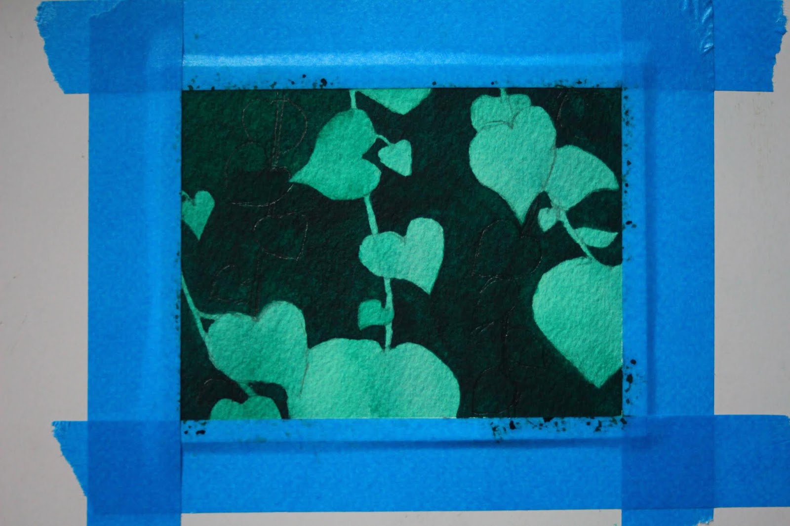
STEP 10: Final Layer
For the final layer, I mixed Viridian, Van Dyke Green, & Ivory Black.
For this layer, we need to paint around the background vines. After you
finish this layer, the background vines should stand out & look like they
are behind our vines in the foreground. If you are a beginner, you can leave
it like this or you can go to shading in the next step.

STEP 11: Shading
This is where it can be complicated. I took a bit of my Veridian which you want
to blend to a medium range of darkness & add some lines where I want to shade
my leaves on my vines in the front. Don't cover the whole leaf. Our goal is to
give it shape. This is when you have to make a choice because your leaves
will not look exactly like mine. I only do 2 or 3 leaves at a time because we
don't want the paint to dry out. Then I rinse my brush & dry it to where
it is damp. I blend & rub my shading lines. I continually rinse and dry my
brush until I am happy with my blending and shading. If I want it to be darker
then I do the process again. I then wait for my shading to dry & make shadows.
As you can see above, where leaves overlap over each other or the vine is below
the leaf, I put a shadow there. I take a bit of my dark mixture from STEP 10
and use that as shadows for the background vines.

FINAL STEP: Unveiling
Once your painting is completely dry, peel the tape.
It is one of the most exciting and satisfying parts of the process.
And you are done!

Let me know how you did in the comments below! Please share!
If you have any questions, leave them in the comments below.
For our fifth layer, we will go slightly darker & paint around
our front vines again. After the paint dries, I recommend taking
your pencil & tracing back over the background leaves. You don't have
to do this, but it may get hard to see them. The layers are going to get
darker, so I do this to see those background leaves better.
If you would like, you can do the shading on your front vines now.
I do that last, but if you are a beginner, you can do it now.
The background layer in the end will be dark, so if you are afraid
of messing up the shading, you can go down to STEP 11 & then
come back to here.
STEP 9: Sixth Layer
Paint another darker layer around your front vines. As you can see in the photo
above, I used my pencil to outline my background vines after I painted this darker
layer around my front vines. I used a bit of the Van Dyke Green as well in this layer.
Depending on your paint, you may have to use a little bit of black to darken it.

STEP 10: Final Layer
For the final layer, I mixed Viridian, Van Dyke Green, & Ivory Black.
For this layer, we need to paint around the background vines. After you
finish this layer, the background vines should stand out & look like they
are behind our vines in the foreground. If you are a beginner, you can leave
it like this or you can go to shading in the next step.

STEP 11: Shading
This is where it can be complicated. I took a bit of my Veridian which you want
to blend to a medium range of darkness & add some lines where I want to shade
my leaves on my vines in the front. Don't cover the whole leaf. Our goal is to
give it shape. This is when you have to make a choice because your leaves
will not look exactly like mine. I only do 2 or 3 leaves at a time because we
don't want the paint to dry out. Then I rinse my brush & dry it to where
it is damp. I blend & rub my shading lines. I continually rinse and dry my
brush until I am happy with my blending and shading. If I want it to be darker
then I do the process again. I then wait for my shading to dry & make shadows.
As you can see above, where leaves overlap over each other or the vine is below
the leaf, I put a shadow there. I take a bit of my dark mixture from STEP 10
and use that as shadows for the background vines.

FINAL STEP: Unveiling
Once your painting is completely dry, peel the tape.
It is one of the most exciting and satisfying parts of the process.
And you are done!

Let me know how you did in the comments below! Please share!
If you have any questions, leave them in the comments below.

Comments
Post a Comment